Creating a stress-free accessible transit app in a comfortable and friendly environment
Cities are constantly evolving in structure and population, leading to a higher demand for transportation. Many public transit users in major cities often find their transit systems to be misleading, inaccurate, and untrustworthy. To address this issue, I conceptualized and designed a transit app solution that provides users with necessary information to successfully reach their destination without any hassles. I worked on this project solo from start to finish.
OVERVIEW
PROBLEM
Due to expansion and numerous bus routes that have recently been added to a major metropolitan city, many riders are frustrated and confused about which bus is theirs to ride. Many of those routes stop at the same bus stop. Riders want to know when their next bus will arrive at a specific stop so that they know how much time they have to get to their bus stop. The working class population are at risk when using outdated or incorrect information.
Easy access. Accurate transit schedules.
Purchasing of transit tickets. User generated data.
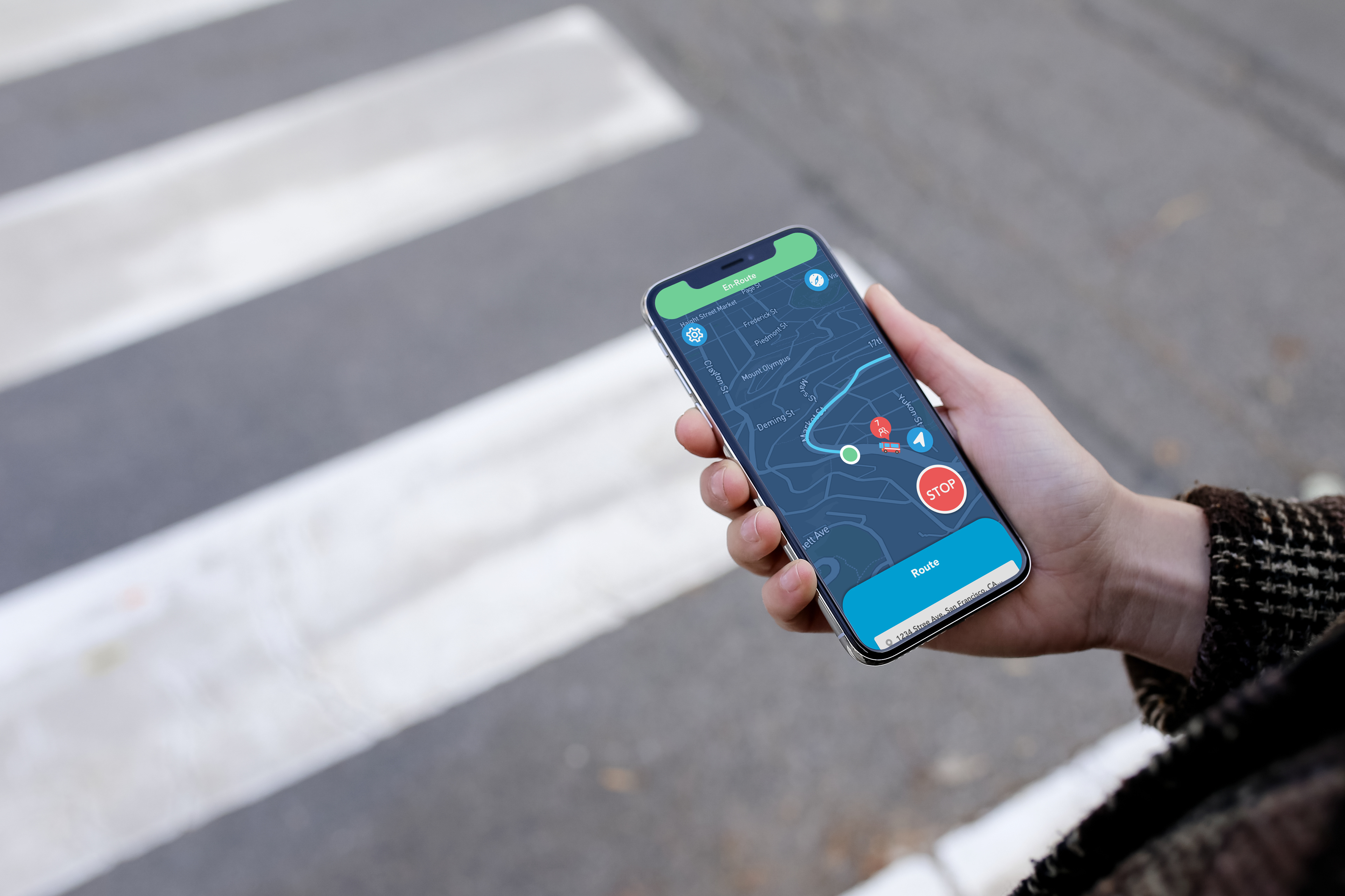
The solution, Commuter Community app, which is designed to solve your daily Transit needs, by providing quick and accurate information. This app is intended to help solve daily Transit needs and frustrations; including: transit schedules, ticket purchasing, and real-time live updates, while on-the-go. The Commuter Community app is a one-stop app, where you won’t need to use any other Transit apps in the market.
DISCOVERY
COMPETITIVE ANALYSIS
I first started off by researching the app market that is related to Public Transportation. I analyzed transit app competitors to better understand the functionality, layout, and design. What is successful and unsuccessful on their apps in terms of accurate schedule capabilities. From there, I took notes and used some elements from each app that I found useful.
Once I’ve obtained survey results, I created personas based on my research findings. Personas helps us focus on our core target audience.
I created two personas based on my research. As shown here for our first example, Amanda, is young adult with a full time job as a nurse who uses the bus daily late at night due to her late night shifts. Late night commutes can be a bit scary and dangerous, which is why Amanda wants to ensure accurate bus schedules so that she doesn’t have to wait at the bus stop for too long by herself.
The next step is to create a user empathy map so that researchers can get a better understanding of the the pain points, frustrations, and positive or negative outcomes of a user. I used Larry as an example of a typical user that commutes. We empathize with them to imagine what they may feel, say, think and do in a particular scenario. This helps us know our audience better.
JOURNEY MAP
The next step is to create a user journey map to illustrate a common scenario Larry will face along his journey. As you can see in the slide, the Journey Map displays the stages Larry will take while riding the bus with a typical Transit app. Underneath the stages are more in-depth details of the users reactions and responses from the journey.
This helps us pinpoint Larry’s frustrations throughout the Journey, so that we’re able to implement solutions within our app.
DEVELOP
Once I've gathered all the necessary information and data to create the app, it was time to start building. To help supplement my structure and design for the app I created the following: a user flow, hand-drawn wireframes, a site map, digital wireframes, the design, prototype, and high-fidelity prototype.
Site Map
User Flow

Site Map
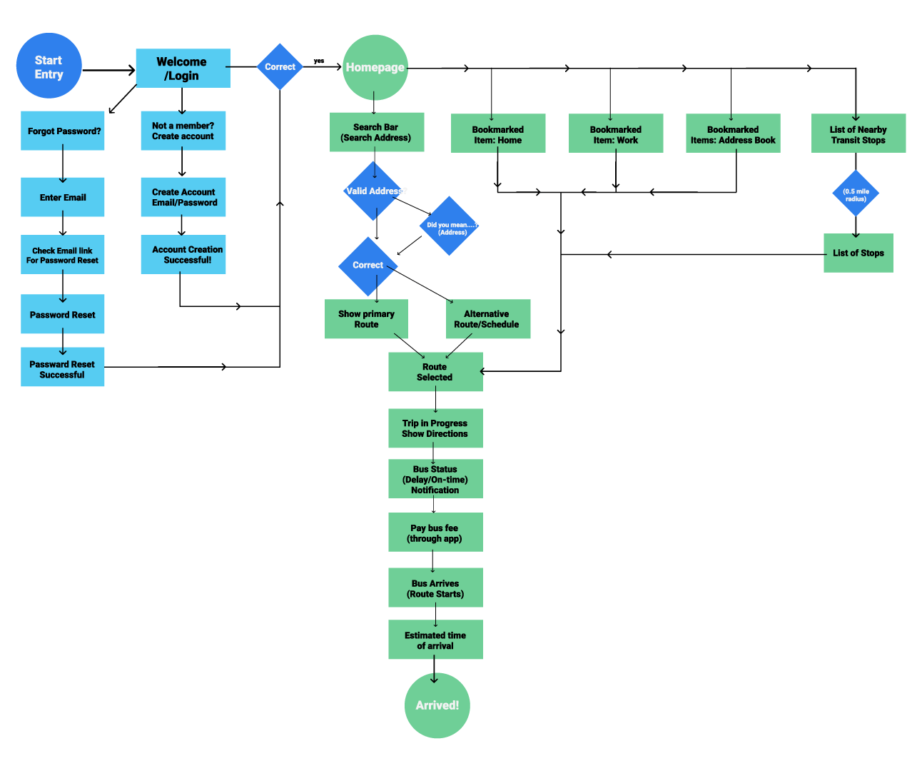
User Flow
Wireframe
Prototype
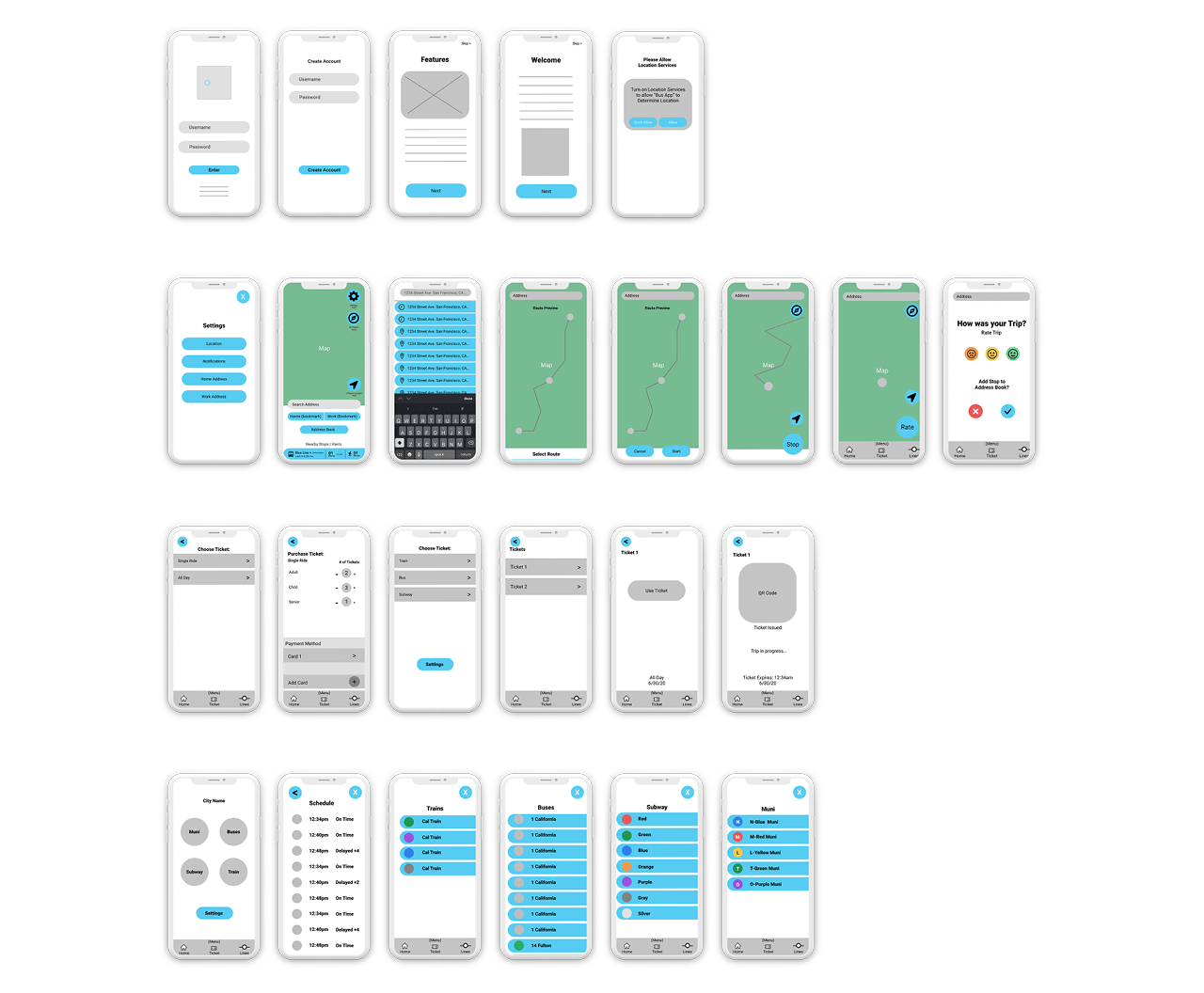
Wireframe
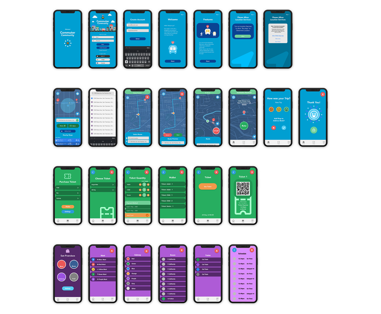
Prototype
- Deliver -
Questions and tasks:
Can you successfully navigate through all parts of the app?
Are all links and buttons accurate/makes sense?
Purchase a ticket.
Successfully navigate through the app to reach your destination.
Find bus schedules to see what is delayed and on time.
Are all links and buttons accurate/makes sense?
Purchase a ticket.
Successfully navigate through the app to reach your destination.
Find bus schedules to see what is delayed and on time.
Key findings:
“Buttons and type fields are the same and need to be differentiated.”
“Add icons for different buttons and fields”
“Great design! It feels like a GPS for Legoland!”
“I want to swipe on this schedule button”
Outcome - What I learned
Users found the layout and design of the app very fun and well thought out and they sometimes forgot that the Prototype was just a prototype and not a full-on app.
The feedback that I obtained from users, helped immensely, especially with tiny details within the app. I was able to identify users pain points and frustrations, and turn them into something useful for future iterations. I had an awesome experience designing this app!
