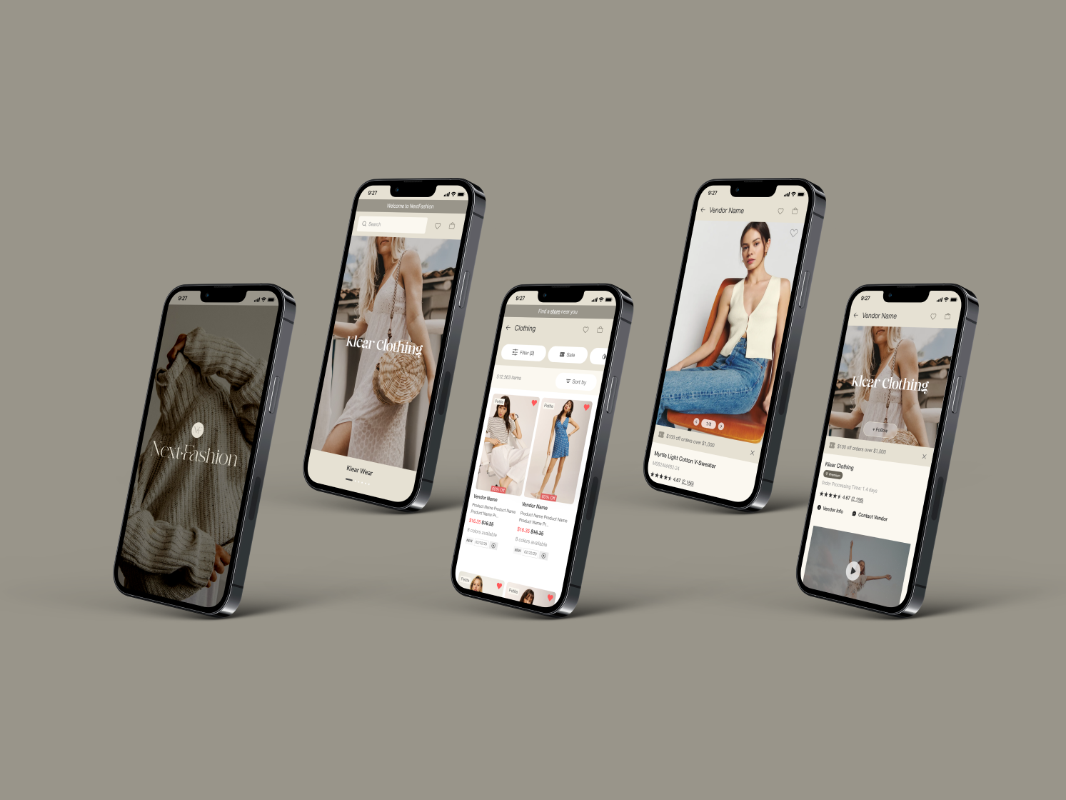
Frontlyne
I was responsible for redesigning the UI of an existing user flow in an app called "Frontlyne." Using a user-centered design process, I created a proper solution that aligns with user's needs and business goals. I successfully created a more intuitive experience, enabling users to complete their goals with fewer clicks and screens.
Task
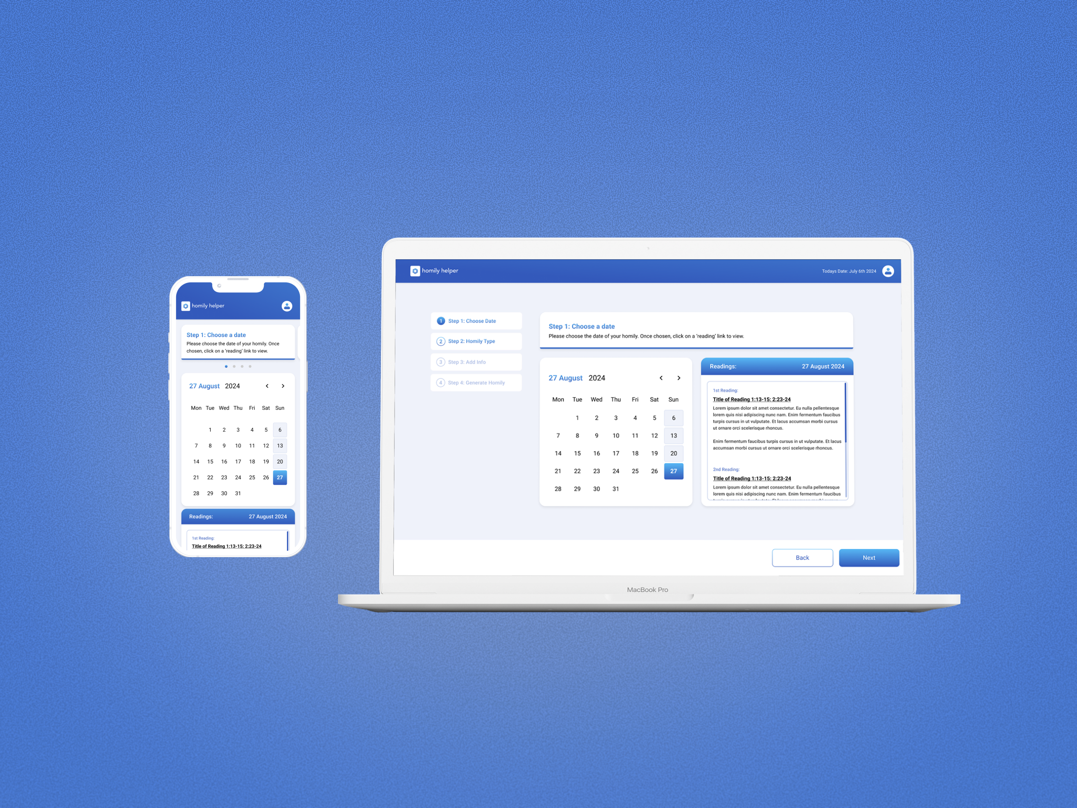
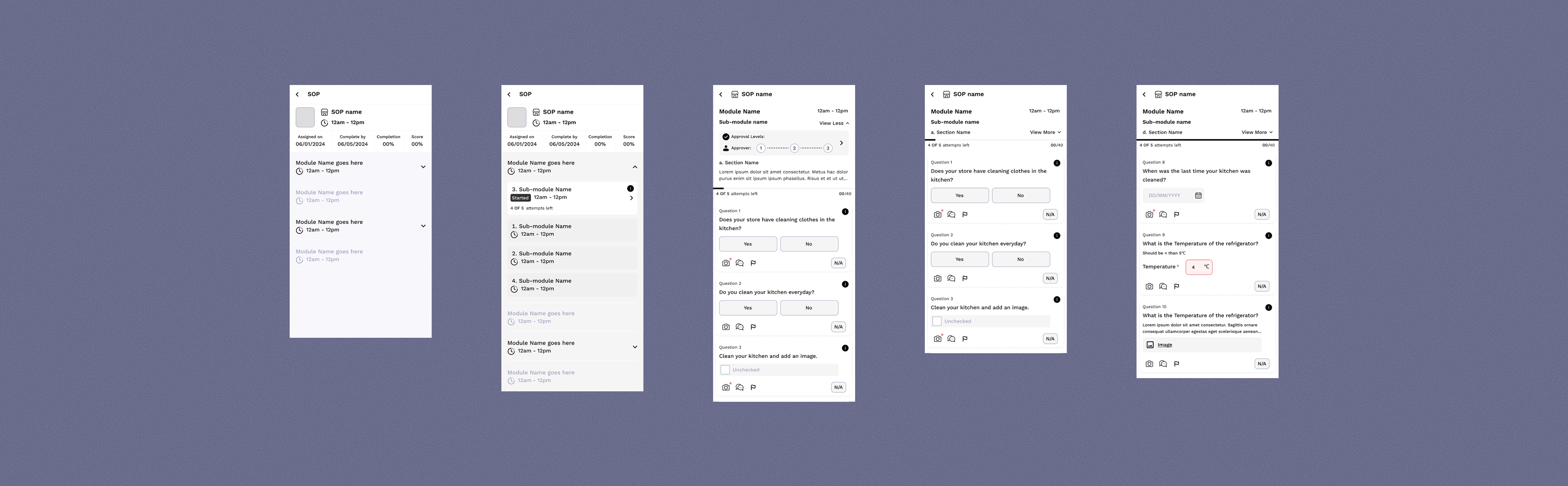
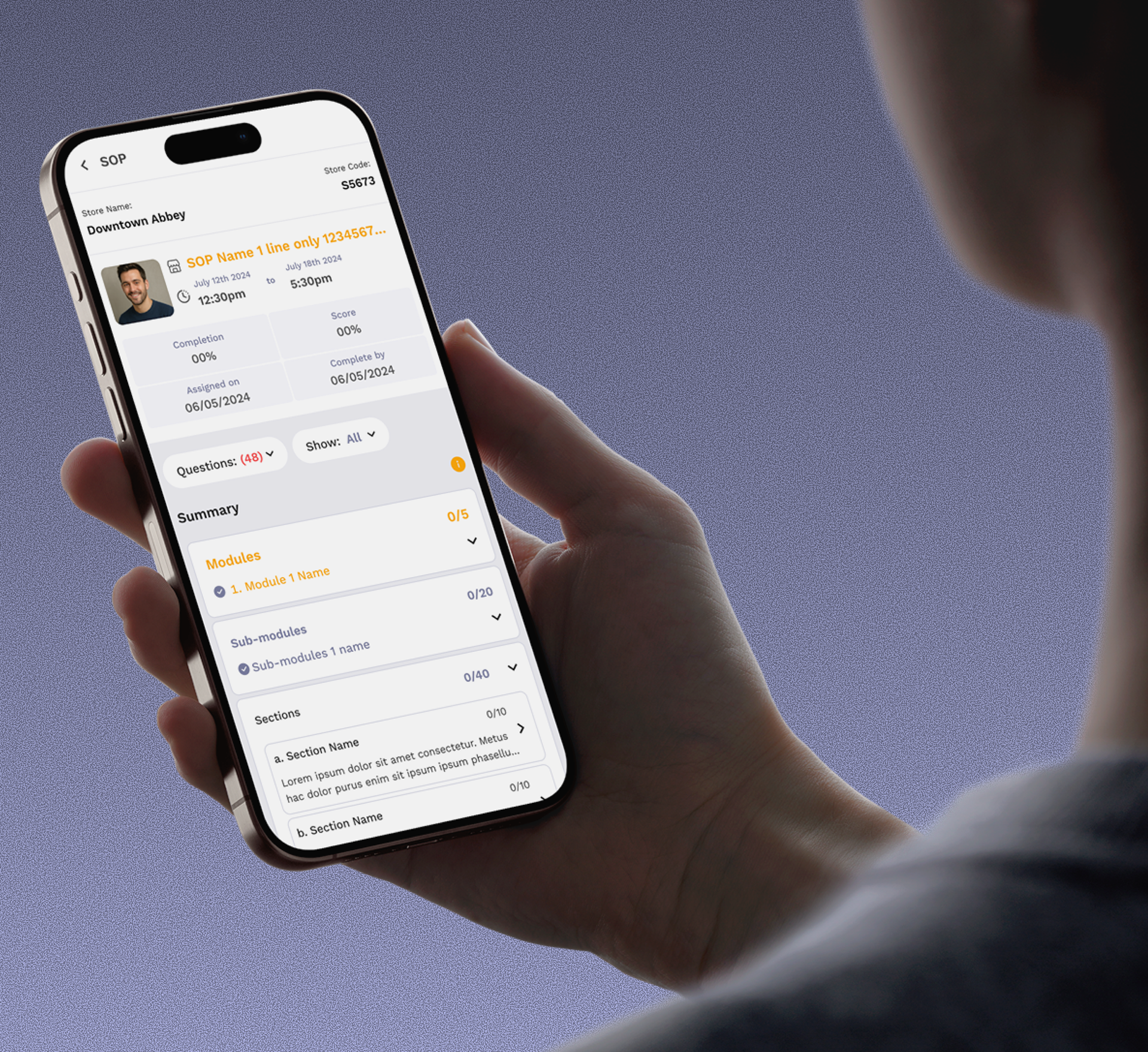
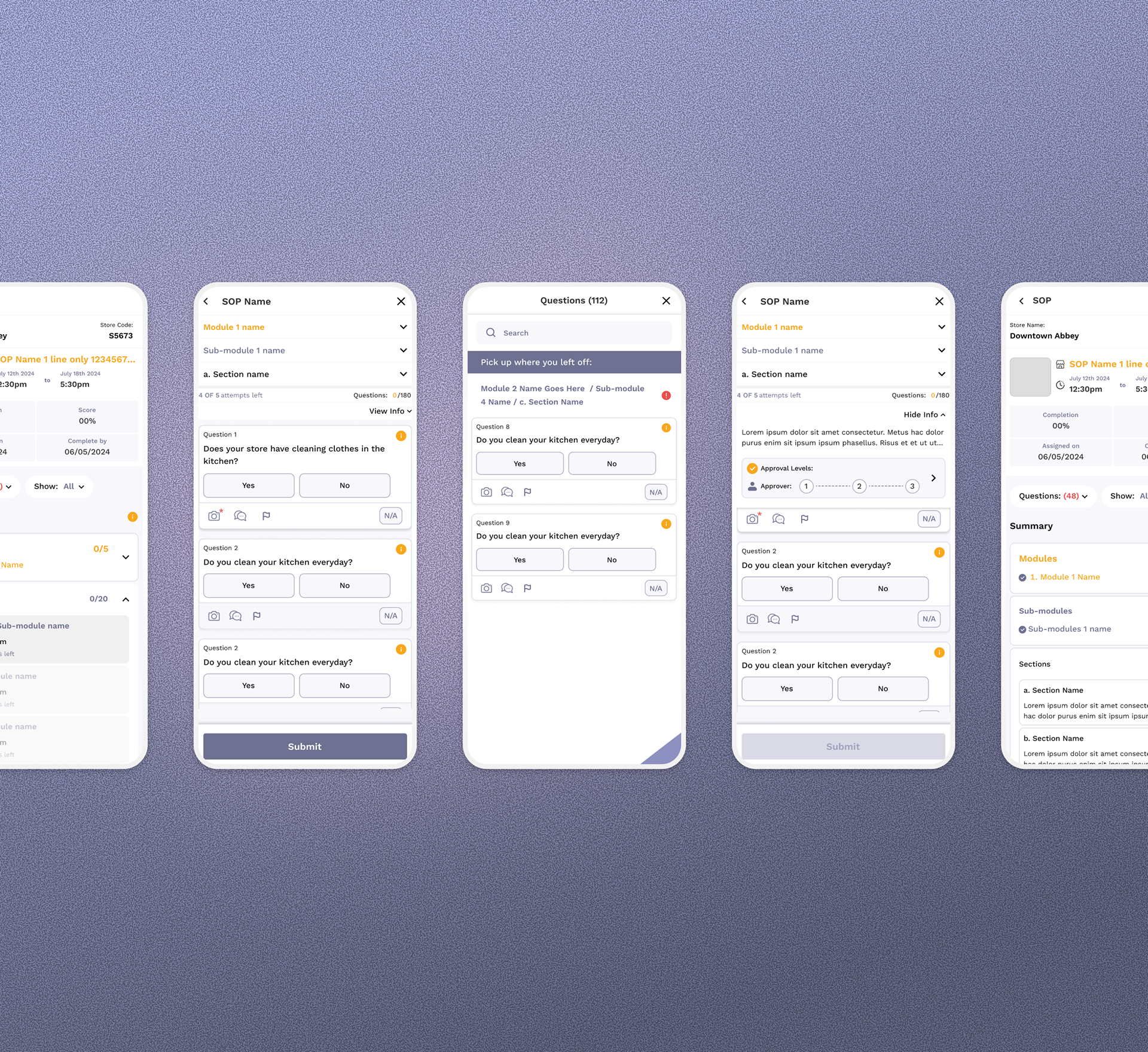
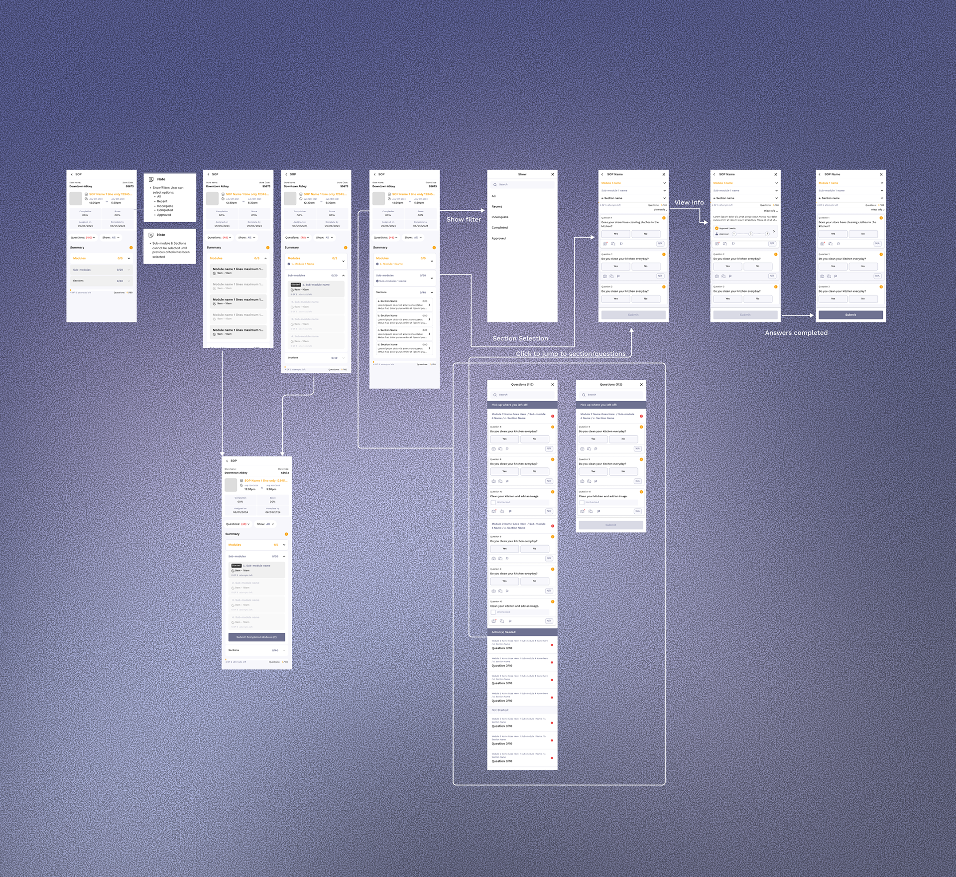
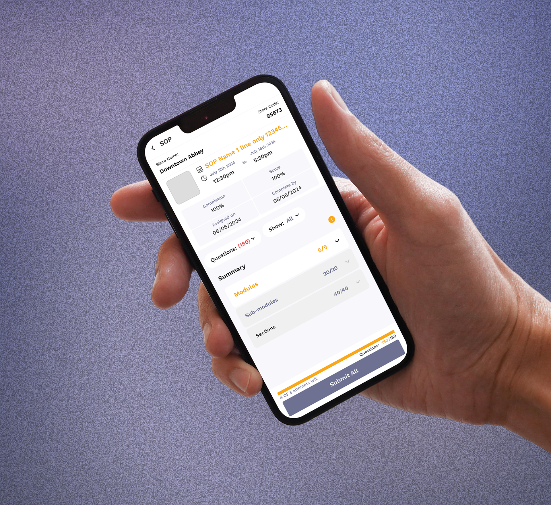
I was tasked with streamlining a front line workers app user flow by reducing the number of actions and screens required for users to access their ‘Tasks’ and ‘Modules.’ Upper management must approve each module in order for employee to continue and succeed. Employees must complete and pass a series of test by using the app. Test results must be approved by a certain amount of upper management in order to continue working. My goal was to make it easier and faster for users to find the information they need, minimizing unnecessary steps and simplifying navigation throughout the app.
My Role
UI/UX design • Wire framing • Layout design • Interaction design • Prototyping
UI/UX design • Wire framing • Layout design • Interaction design • Prototyping
Goals
Streamline the user experience by reducing the number of screens and actions required for users to view and complete their goals and tasks.
Intuitive Interface: Organize information clearly and introduce components and interactions that enhance overall usability.
User Interactions: Incorporate micro-interactions to create a friendlier and more engaging experience with new features.
Component Construction: Test and implement new, familiar components—such as toggle buttons, modals, and toast pop-ups—to improve functionality and user satisfaction.
Challenges
Fewer Clicks, Fewer Screens: Users were frustrated by having to navigate back through multiple pages just to check the status of their tasks. Streamlining this process was a top priority.
Introducing New Components & Interactions: Designing concise, intuitive interfaces for mobile devices is essential when accommodating large amounts of information and functionality. My focus was on creating effective layouts that excel on smaller screens.
Managing Information Overload: To reduce user frustration, I aimed to minimize unnecessary steps. By introducing subtle interactions, users can now access additional information without leaving their current screen.
Success
After multiple rounds of user flow construction and several iterations, we identified an effective solution that minimized the need for users to navigate back and forth to access essential information. By organizing ‘Tasks’ and ‘Modules’ on the mobile dashboard with collapsible menus and sub-menus, we significantly reduced user pain points and streamlined the experience.
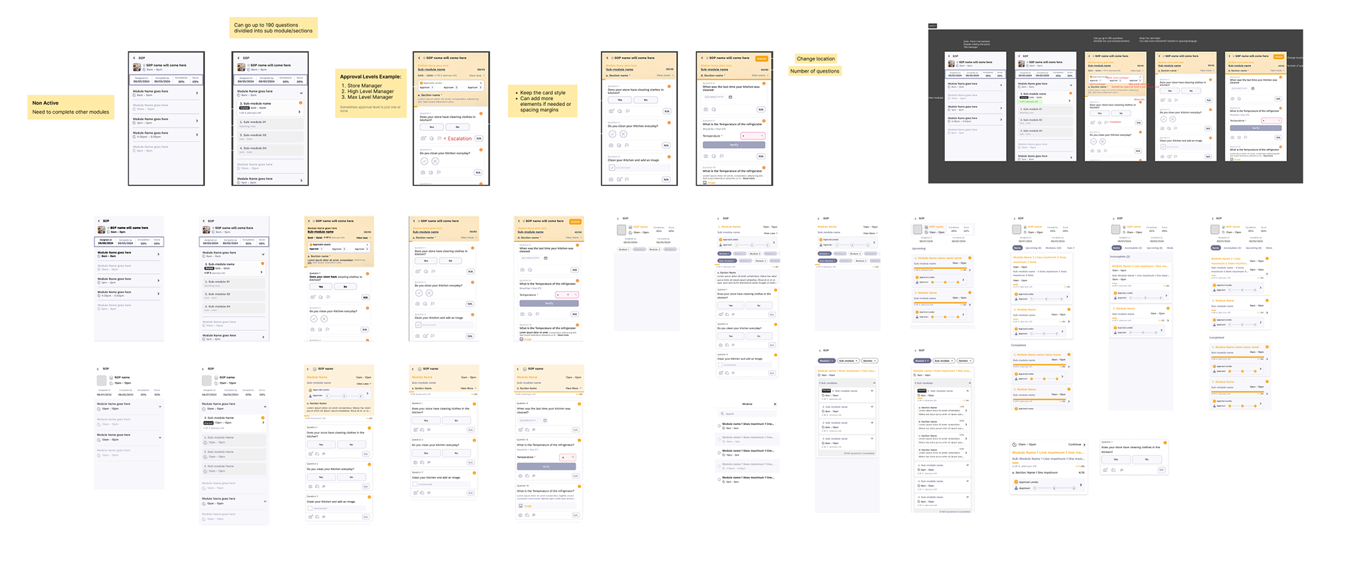
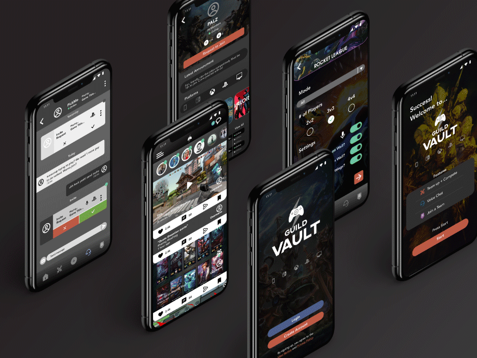
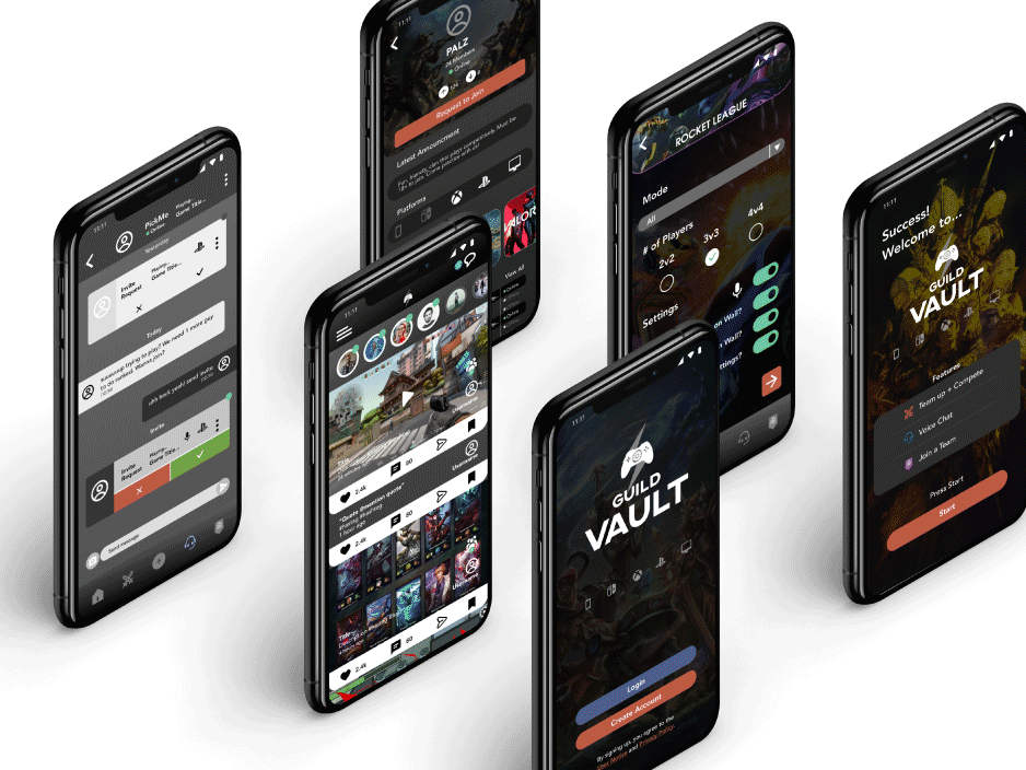
Designs & Iterations
Streamlined navigation by reducing the number of actions and screens. Introduced collapsible menus and sub-menus on the dashboard, allowing users to access information without leaving their current screen. Designed and implemented new components such as toggle buttons, modals, and toast pop-ups to enhance usability and satisfaction. Incorporated micro-interactions to make the experience more engaging and friendly. Conducted multiple rounds of user flow construction and iteration, refining the design based on feedback and observed user behaviour. Focused on mobile optimization, ensuring layouts were effective on smaller screens and information was presented clearly.
Impact & Results
After many iterations on designs and interactions, the employer and stakeholders are currently using my designs in their app. Users have found the the new features intuitive, simple, and easy to use.
What I learned
Although the mobile viewport is a smaller screen size than desktop, there are many different ways a product can display data & information. By using common components and introducing micro-interactions that makes sense of the user journey, I've learned to connect the dots in the user experience that feel more fluid and intuitive for the user.
While this was a relatively small project, it provided very valuable insights into designing for layout & functionality. I truly enjoyed the opportunity to tackle these challenges and grow as a designer.
"Your design was developed and incorporated into our product. And our customers who are using the feature, appreciate the simplicity and ease of use. Thank you once again!"
-Susanna Jacob, Head of Product & Co-founder of Frontlyn

Thank you for visiting!
- Matthew Mauricio